Tuesday, 10 December 2013

GARDEN OF ANXIETY GETS GATED


Finally, we got around to installing the sturdy new garden gate.  Sadly, it's not a great time of year for outdoor photographs with the sky being a nice shade of December English grey, but here it is.

It's also interesting to contrast the after to the before to see how far it has come.

Dec 2013


April 2010


You'll see that the original gate was positioned in the right hand side and was a lot shorter and smaller.  The right hand fencing was not replaced but was repainted in Cuprinol garden shades: Willow which was a good choice as so many neighbours have remarked that my garden plot is bigger than theirs - but it isn't.  It just looks that way because the greyish green is not as constricting as a woody brown fence colour.


Note, my neighbours replaced gate on the left.  

From the inside of the garden, you can see how we completely landscaped it - although the original concrete path determined the new design.  It is now below the paving.

The new gate is triple braced, so unlike the trellis version that we built before, this one won't sag.  I can see that next summer I will have to give the whole thing a fresh lick of paint to get a colour match.


April 2010


December 2013

Saturday, 7 December 2013

KITTY TV AND SOME DVD FAVOURITES

It has always amused me when I've observed the Pepper kitty momentarily watching TV.  

Occasionally her interest has been held longer than usual if a wildlife special is on:  She was particularly fascinated by David Attenborough's Tiger - Spy in the Jungle, which she got right into.  A little cat who likes watching big cats.  This made me wonder about programming - what if there was a channel specifically designed for kitties, broadcasting the types of shows that they might like to watch.  Would they watch it?  Could Kitty TV one day become a reality when there will be so many channels that everybody will be catered for?...     


This little kitty would watch, as shown above.  I found an ideal DVD for her seemed to be the rather dry looking 'Everyday British Birds' which I picked up from a bargain bin for £1.99.  Once I'd tapped the TV screen and announced 'Birdies! Birdies!' which is a word that she understands from watching them through the windows, she was spellbound by it.  Which may prove with the right material your moggie could become a TV addict.  I supposed now I'll have to allocate space for her own DVD collection.  


'No, you can't have the TV remote back...'

Friday, 6 December 2013

BEDROOM ONE: BOOKCASE

A part of the Alcove project was getting the MDF cut at the same time to build a bookcase in my bedroom. I knew I wanted something floor to ceiling but ended up following the same design as the alcove units - but with a slight difference on the shelving supports, which in the final version below, I reversed the design.


There's not much depth to this unit around 10 inches.  It's enough space for a layer of books with about 2 inches in front for a picture frame or slim ornament.  I find a lot of the shop bought bookcases the depth is often too deep and there is a lot of wasted space.  

I wanted to get a picture before I started filling it with books, although a mini hifi unit has already been cabled in.  Above the unit was enough space to install a pair of IKEA bookcase lamps.  Since the mirrored wardrobe doors are at a right angle to the bookcase the lights will also be useful for dressing.


LIVING ROOM
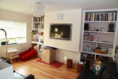
Still in progression but a little more work has been done:  The Venetian blind has been hung and the chandelier installed. 


All that's left now to complete the alcove units is to order the custom made doors.
 

Wednesday, 4 December 2013

INSPIRATION: AERO - THOMAS O'BRIEN


One of my favourite design books at the moment is AERO which documents the contemporary history, style and success of NY designer and store owner, Thomas O'Brien. His love of vintage 1920s & 30s style aethetics combined with a passion for collecting; sometimes renovating and refurbishing original items; and designing,  resulted in his unique trademark homestyle called 'warm modernism' - which is sold in his home emporium store.   


Below are photographs of his Manhattan apartment full of interesting pieces and artworks. 


More of his designs and products can be found here:-


www.aerostudios.com


Footnote: 59 Days nows without a cigarette!